What Your Homepage Must Answer in 5 Seconds
Most local service business owners know their website should bring in more calls. What many miss is how fast the decision actually happens.
A visitor lands on your homepage. In the first five seconds they scan for answers to a handful of questions. If those answers are not clear, they leave. No form fill. No call. No booked job.
This is not about fancy design or more pages. It is about making the right information impossible to miss right away. Get this right and more of the right people stay long enough to contact you.
What visitors are really looking for in those first seconds
People searching for a plumber, HVAC tech, landscaper, or cleaner in Tampa Bay (or anywhere else) are not browsing for fun. They have a problem and want it handled by someone reliable. Their brain is running a quick checklist:
- Is this company in my area?
- Do they handle the exact service I need?
- Do they look like they know what they are doing?
- How do I reach them right now?
If any of those answers take more than a glance to find, the visitor often hits the back button and tries the next result.
The five questions your homepage must answer fast
Here is a practical diagnostic. Open your homepage on a phone and time yourself. Can a stranger answer these five questions in under five seconds?
- What do you do? The headline or first line should state the service clearly. "Tampa Bay Plumbing & Drain Cleaning" is better than "Quality Solutions for Your Home."
- Where do you work? City, neighborhood, or service area should be visible without scrolling. Local searchers care about this immediately.
- Who is this for? Residential, commercial, emergency, or specific job types. Make it obvious so the wrong visitors leave and the right ones stay.
- Why should they trust you? A short proof point works: years in business, number of jobs completed, licenses, or a strong review average. Keep it tight.
- How do they take the next step? Phone number, click-to-call button, or clear "Request Service" form must be easy to see and use, especially on mobile.
If any of these require hunting, your homepage is losing leads before the conversation even starts.
A real example from a Tampa Bay HVAC company
A mid-sized HVAC company in the Tampa Bay area had a clean-looking site. Nice photos of equipment, a long "About Us" section, and a contact form buried lower on the page. Their Google Ads were bringing traffic, but conversion rates stayed low.
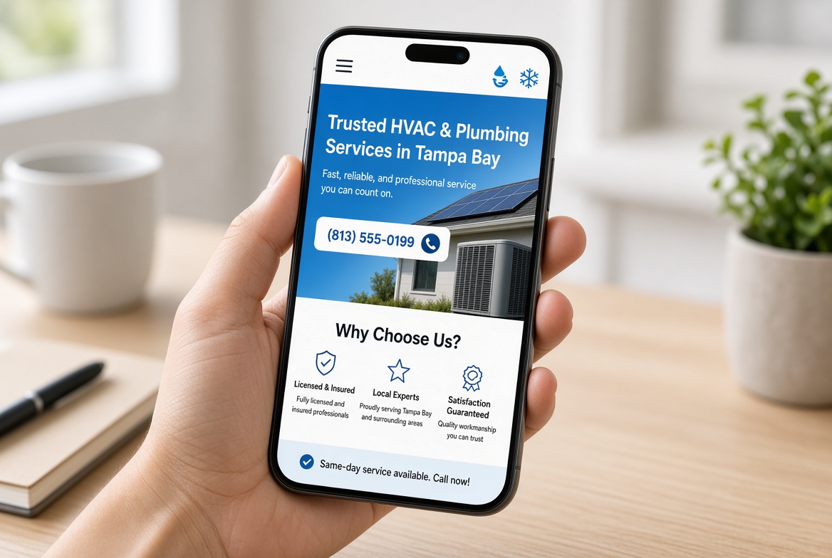
When we timed the homepage on a phone, the service area and emergency phone number only appeared after scrolling. The main headline talked about "comfort solutions" instead of air conditioning repair and installation. Trust signals (licenses and review scores) were on a separate page.
They made three focused changes:
- New headline that named the services and the area in one line
- Phone number and "Schedule Service" button fixed near the top on mobile
- One short trust line right under the headline with years in business and a review average
Within a few weeks the same ad spend produced noticeably more qualified calls and form submissions. Nothing else about the site changed. The first five seconds finally answered the questions that mattered.
Common ways homepages hide the answers
These patterns show up often with local service sites:
- Headlines that sound like brand slogans instead of clear service statements
- Phone numbers only in the footer or behind a menu on mobile
- Service area listed only on a contact or about page
- Trust proof pushed below the fold or onto separate pages
- Multiple competing calls to action that create decision friction
None of these require a full redesign to fix. Most can be corrected by rewriting the top section and adjusting the mobile layout so the critical answers stay visible.
A quick checklist you can run today
Grab your phone, open your homepage, and check these items:
- Does the first screen state the main service and location without scrolling?
- Is the primary phone number or booking button visible and large enough to tap easily?
- Is there at least one concrete trust signal near the top?
- Would a first-time visitor know within five seconds whether you handle their type of job?
- Is the next step obvious, or does the visitor have to figure out what to do?
If you answer "no" to two or more, the homepage is quietly filtering out good leads.
What to fix first
Start with the top of the page. Rewrite the headline so it answers "what" and "where." Move the phone number and main action button higher. Add one short trust line. Then test it on a real phone with someone who does not know the business.
You do not need a new design system or dozens of new pages. You need the first five seconds to do their job: confirm to the right visitor that they are in the right place and show them exactly how to reach you.
When the homepage answers the right questions fast, more of the traffic you already pay for turns into actual conversations and booked work. That is the kind of focused system change that reduces wasted leads without adding complexity to the rest of the business.
Are the calls getting away from you?
I work with Tampa HVAC and plumbing companies that already run at least 3 trucks. Call or text me.